Mashrouk
Turning a shared ride app into a focused landing page
Mashrouk is a shared-ride app for travellers in Saudi Arabia: riders choose a seat on a shared trip and book it in the app. I wrote the English and Arabic landing page that explains the idea and leads to the download.
Read the case study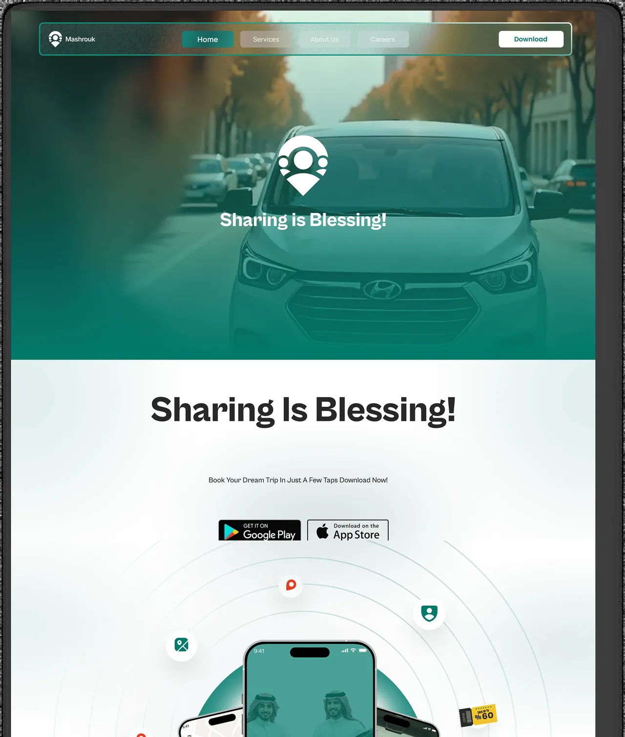
The project at a glance
- Market
- Saudi Arabia
- Project type
- App landing page
- Languages
- English · Arabic
- Website
- mashrouk.com
- My role
- Landing-page structure, English and Arabic copy, UX writing and search-aware wording. Visual design was shared with the team.
- Scope
- Landing-page structure · Bilingual website copy · UX writing · Search-aware content
- Deliverables
- The opening promise, feature and booking explanations, and the app-download calls to action, in both languages.
A shared-ride app with one job for its website
Mashrouk lets riders share a trip and pick their seat through the app. The website has a narrow, practical job: help a first-time visitor understand the service quickly, then send them to the App Store or Google Play.
A new idea needs explaining before it gets installed
Shared rides are still an unfamiliar idea for many riders. A visitor deciding whether the app fits a trip needs to know what is shared, how seats work and where booking happens, before being asked to download anything.
A page built around the rider’s decision
I ordered the page as a short journey: the travel promise, what a rider can do, a concrete booking scenario, then the download. The app-store buttons appear early for anyone already convinced and again after the explanation for everyone else. The Arabic page follows the same journey in its own words and leads with how the trip feels.
A complete landing page in two languages
The finished page runs from the opening promise to the final download panel, in English and Arabic, and the live pages still follow that sequence.
The opening
A short travel promise with an immediate route to both app stores.
Features and booking
Seat choice, support and the booking steps, explained in the order a rider meets them.
Download moments
App-store actions at the top and again at the end, once the rider’s questions are answered.
The Arabic page
Its own wording for the trip experience, written for Arabic readers rather than translated line by line.
From the promise to the download
Screens from my original project presentation, following the page from top to bottom.
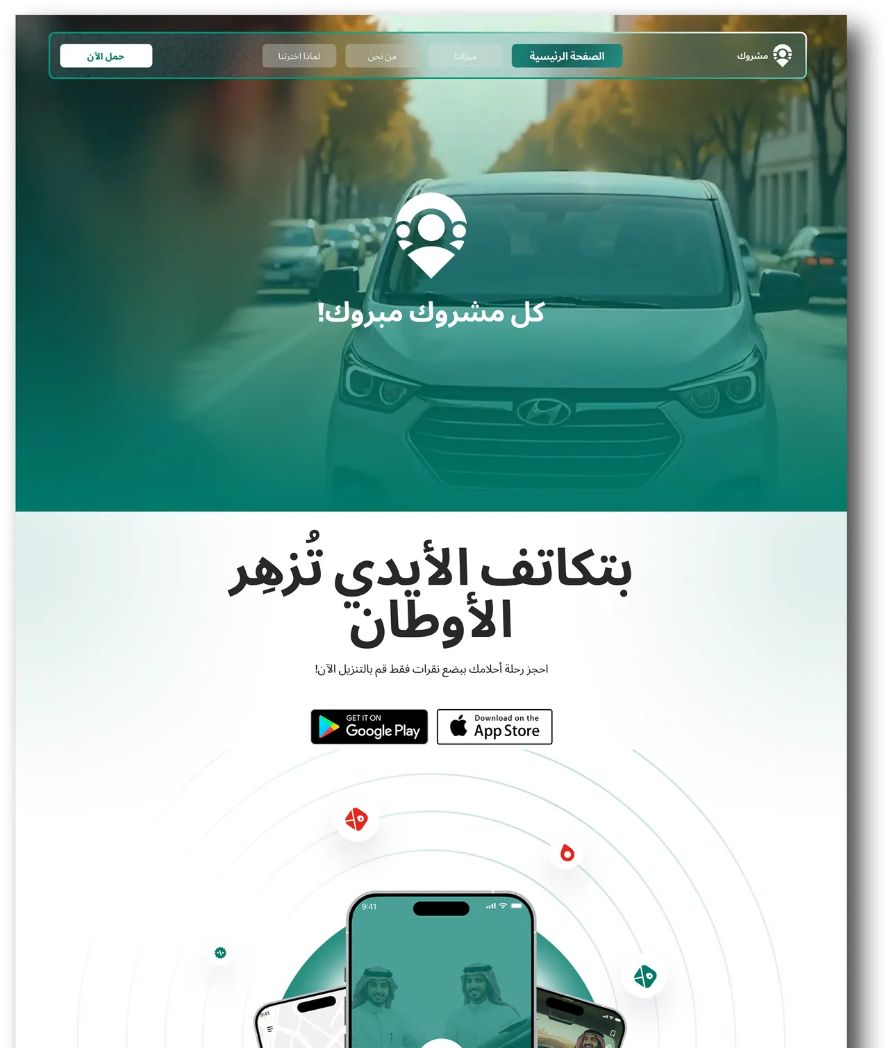
The opening in both languages: one promise, with the download route visible from the first screen.
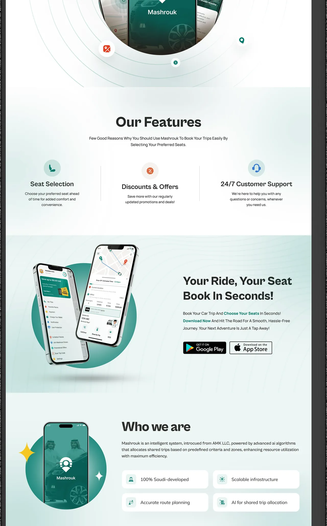
Features lead into a concrete booking explanation, so the rider knows what will happen inside the app.
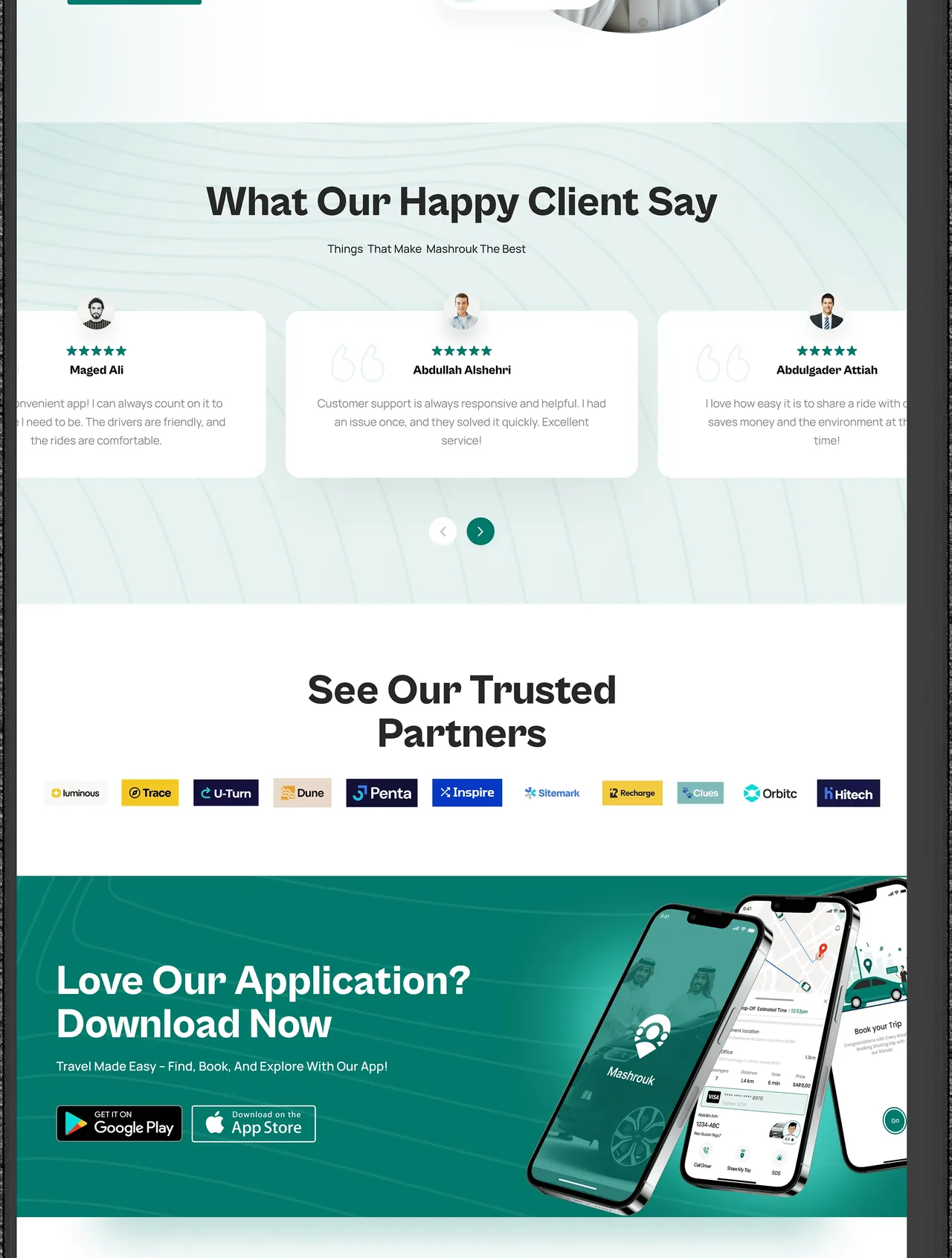
The page ends where it started, at the app stores, now that the rider has the full picture.